
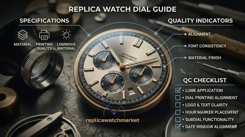
The dial is the most examined surface on any watch — the first thing a buyer looks at in a product photo and the first thing a QC reviewer scrutinizes in an inspection image. Dial quality communicates production precision across every element: printing sharpness, index alignment, surface finish, lume application, and sub-dial geometry. A dial that reads correctly under casual inspection can still reveal production tolerance failures under close examination. For a broader overview of what separates quality grades in replica watches, see the Replica Watch Guide.
Table of Contents
- Dial Elements
- Dial Surface Types
- Grade Comparison
- QC Checklist: Dial
- Frequently Asked Questions
- Related Guides
Dial Elements
Dial Surface
The dial surface is the base layer visible through the crystal — the foundation on which all other dial elements sit. Surface finish is reference-specific: sunburst dials show a radiating grain that shifts under light, matte dials absorb light evenly, lacquered dials reflect with a wet depth, and meteorite dials carry natural patterning unique to each piece. The surface finish is not a cosmetic detail — it is a defined specification of the reference, and a dial that reads as matte when the reference specifies sunburst is a production specification error.
At high-end grade, dial surface finish is produced to the reference specification and holds its character under different lighting conditions. At lower grades, sunburst finishes read as flat, lacquer depth is shallow, and surface uniformity breaks down at the dial edges.
Indices
Indices are the hour markers on the dial — applied as printed numerals, painted markers, or physically applied metal pieces depending on the reference. Applied indices sit proud of the dial surface and cast a shadow under raking light; printed indices are flat. The type, shape, size, and spacing of indices are reference-specific and among the most scrutinized details in QC evaluation.
At high-end grade, applied indices are correctly shaped, evenly spaced, perfectly upright, and lume-filled to a consistent level. At lower grades, tilted indices, uneven lume fill, incorrect index geometry, and inconsistent spacing between positions are common failures — all visible in straight-on QC photos under direct light.
Sub-dials
Sub-dials are the smaller subsidiary registers within the main dial — used on chronographs to display elapsed time, on GMT references for a second time zone, and on any complication requiring a dedicated display. Sub-dial placement, size, surface finish, and internal index quality must match the reference specification. A sub-dial that is off-center, incorrectly sized, or finished differently from the main dial is a production tolerance failure.
Sub-dial quality is assessed across the same criteria as the main dial — printing sharpness, index alignment, surface finish — with the additional requirement that sub-dial geometry and positioning match the reference exactly. For a real-world assessment of how dial quality affects daily wear experience, see Can You Wear a Replica Watch Daily?
Date Window
The date window is the aperture cut into the dial through which the date disc is visible — typically at 3 o'clock on most references. Date window quality is assessed by numeral centering within the aperture, disc color accuracy, font correctness, and aperture edge finishing. A numeral that is partially cut off, a disc color that does not match the reference specification, or a poorly finished aperture edge are all production failures visible in close QC photos. For a reference-specific example of how date window specifications vary across dial designs, see Replica Rolex Datejust Models Guide.
Rehaut
The rehaut is the inner bezel ring between the dial edge and the crystal. On references that carry engraving on the rehaut — serial numbers, minute tracks, or repeated brand text — alignment with dial indices, engraving depth, and text spacing are precision indicators assessed in close QC photos. A rehaut that carries shallow engraving or misaligned text relative to the dial indices is a detail-level quality failure that separates high-end grade from lower tiers.
Lume Application
Lume is the luminescent compound applied to indices, hands, and — on some references — dial markers to provide visibility in low light. Lume application quality is assessed by fill consistency, surface level, color accuracy, and the absence of overflow onto the dial surface. Each lume plot should be filled to the same level, consistent in color, and contained within the index boundary. Overflow, underfill, bubbling, and color inconsistency between plots are production failures visible in close QC photos — and particularly apparent in darkness photos requested from the seller.
Lume color is reference-specific — cream, green, and blue lume variants exist across different references and production eras. An incorrect lume color is a specification error regardless of fill quality. For a full breakdown of lume compounds and how they perform across grades, see Replica Watch Materials Explained.
Dial Surface Types
| Surface Type | Appearance | Light Behaviour | Common References |
|---|---|---|---|
| Sunburst | Radiating grain from centre | Shifts dramatically with angle | Dress, datejust, sport |
| Matte | Flat, even texture | Absorbs light evenly | Pilot, field, sport |
| Lacquered | Deep, wet-look surface | Reflects with depth | Dress, vintage |
| Fumé / Gradient | Colour transitions from centre | Shifts with angle | Dress, sport luxury |
| Guilloche | Engine-turned geometric pattern | Catches light across pattern | Dress, dress sport |
| Meteorite | Natural Widmanstätten pattern | Unique per piece | High-end dress |
Grade Comparison
For a full breakdown of quality tiers and what separates mid-tier from high-end grade production, see Replica Watch Quality Levels.
| Quality Point | Mid-tier Grade | High-end Grade |
|---|---|---|
| Dial surface finish | Flat, lacks depth | Correct finish, holds character |
| Applied indices | Tilted, uneven spacing | Upright, evenly spaced |
| Printing sharpness | Soft edges, bleed visible | Sharp, correctly weighted |
| Lume fill | Uneven, overflow, bubbling | Consistent level, clean boundary |
| Sub-dial placement | Off-center, incorrect size | Correct position and geometry |
| Date window | Off-center numeral, wrong font | Centered, correct disc color |
| Rehaut engraving | Shallow, misaligned | Crisp, correctly aligned |
QC Checklist: Dial
Use this checklist when reviewing QC photos of any replica watch dial. For a broader list of common issues to look for across the full watch, see Common Replica Watch Problems New Buyers Face.
Dial Surface
- Surface finish matches reference specification — sunburst reads as sunburst, matte reads as matte
- Surface finish uniform across full dial — no flat patches on sunburst, no sheen variation on matte
- Dial color matches reference under neutral lighting — not oversaturated, not washed out
Indices
- All indices upright — no tilt visible in straight-on QC photo
- Index spacing consistent around full dial — no crowding or gaps at any hour position
- Index shape correct for reference — correct width, length, and profile
- Applied indices sit flush at base — no lifting at edges visible under raking light
Lume
- Lume fill level consistent across all plots — no underfilled or overfilled indices
- No lume overflow onto dial surface around index boundaries
- Lume color consistent across all plots — no color variation between positions
- Request darkness photo to verify lume charge and uniformity
Printing & Text
- Brand text sharp and correctly weighted — no soft edges, no bleed
- Model text and additional dial text correctly positioned and spaced
- Font weight and style matches reference specification
Sub-dials & Date Window
- Sub-dials centered on correct position — no offset visible in straight-on photo
- Sub-dial size proportional to main dial — not too large, not too small
- Date numeral centered within aperture — not cut off at top, bottom, or sides
- Date disc color matches reference specification
- Aperture edges clean — no rough finishing, no lacquer bleed into window
Skeleton and Open-Worked Dials
A skeleton dial removes material from the dial plate to expose the movement beneath — bridges, gears, balance wheel, and escapement become visible through the dial surface. The result is a watch that functions simultaneously as a display of mechanical engineering and a timekeeping instrument. Skeleton dials appear across multiple replica references: AP Royal Oak Skeleton, Patek Philippe Nautilus Skeleton, Richard Mille RM series, Hublot Classic Fusion Skeleton, and TAG Heuer Carrera Skeleton editions.
Types of Skeleton Dial
Full skeleton removes material across the entire dial plate, leaving only structural bridges and movement architecture visible. Open-worked skeleton retains a partial dial structure — typically the chapter ring and hour markers — while opening windows to show selected movement components. Semi-skeleton combines a partial dial surface with skeletonized sections, producing a dial that reads as conventional at a glance but reveals movement detail on closer inspection.
The quality of a skeleton dial is assessed differently from a conventional dial. The primary criteria are bridge finishing — whether machined surfaces are cleanly polished or brushed to the reference specification — movement beveling and anglage quality, and the legibility of the time display against the visual complexity of the exposed movement beneath. A skeleton dial that is difficult to read the time from is a production failure regardless of how well the movement finishing reads in photographs.
What to Check in QC Photos
Bridge finishing should be even — polished surfaces should read as consistent, brushed surfaces should show uniform grain direction without cross-hatching or tool marks. Beveling at bridge edges should be consistent in width and angle across all surfaces. The movement should be correctly oriented within the case — bridges running in the wrong direction relative to the reference specification are a production error visible in straight-on QC photos. Hour markers and hands should read clearly against the movement background — if the time is difficult to read in a static photo, it will be difficult to read on the wrist.
Tapisserie Patterns — Méga and Grande
Tapisserie is the term used by Audemars Piguet to describe the geometric guilloche pattern applied to Royal Oak and Royal Oak Offshore dials. The pattern is applied by machine engraving on genuine pieces — a process that produces thousands of precisely cut squares across the dial surface, each catching light individually to create a texture that shifts dramatically under movement. Two pattern variants appear across Royal Oak production, and both appear extensively across AP replica references.
Méga Tapisserie
Méga Tapisserie uses a larger square pattern — approximately 3mm per square on the genuine reference — and is used on the standard Royal Oak 15510ST and related models. The pattern is bold enough to read clearly at normal viewing distance and produces a strong light-catching effect that defines the Royal Oak's visual character. On replica pieces, Méga Tapisserie quality is assessed by pattern uniformity, square size consistency, and depth of cut — shallow pattern engraving reads as flat and printed rather than three-dimensional. The pattern should extend to the dial edge without distortion or compression at the chapter ring boundary.
Grande Tapisserie
Grande Tapisserie uses a larger, coarser square pattern and is applied to Royal Oak Offshore references. The squares are larger than Méga Tapisserie and produce a more prominent, graphic texture that suits the Offshore's larger case diameter and sportier design language. The assessment criteria are the same as Méga Tapisserie — uniformity, depth, edge consistency — but the pattern scale makes irregularities more immediately visible. A Grande Tapisserie dial with inconsistent square sizes or shallow engraving is apparent even in casual inspection of QC photos.
Tapisserie on Hublot References
Hublot uses similar guilloche-inspired patterns on Big Bang and Classic Fusion dials — referred to as Méga Tapisserie in product descriptions but distinct from the AP pattern in scale and geometry. On Hublot references, the pattern serves the same function — creating a textured surface that catches light across the dial — but the specific pattern geometry follows Hublot's design language rather than AP's. The quality criteria are identical: uniformity, depth, and consistency across the full dial surface.
The Cyclops Lens
The Cyclops lens is the small convex magnifying lens positioned over the date window on the crystal — a Rolex design element introduced in 1953 and now present on virtually all date-bearing Rolex references. The lens magnifies the date numeral 2.5× on genuine pieces, making the date immediately legible without bringing the watch close to the eye. Its presence, positioning, and magnification quality are among the most scrutinized details in Rolex replica QC evaluation.
What Separates Good from Poor Cyclops Quality
Cyclops lens quality has three components: magnification power, positioning accuracy, and optical clarity. Magnification should be 2.5× — the date numeral should appear significantly enlarged, not merely visible. Positioning must place the lens directly over the date window center, not offset to any side. Optical clarity determines whether the magnified numeral reads as sharp or distorted — a lens with poor optical quality produces a date that is magnified but blurry, which is both a functional failure and an immediate visual tell distinguishing replica from genuine.
On high-end AAAA+ grade pieces, Cyclops magnification approaches 2.5× with clean optical quality and accurate positioning. On lower grade pieces, magnification is often insufficient — producing a lens that enlarges the date only marginally — or the lens is positioned slightly off-center, creating an asymmetric appearance in straight-on QC photos. Checking Cyclops position and magnification is a standard element of any Rolex replica QC review.
How to Assess Cyclops in QC Photos
Request a close-up QC photo of the date window at 3 o'clock under direct light. The date numeral should appear clearly enlarged within the Cyclops aperture — noticeably larger than the numerals on an equivalent watch without the lens. The lens itself should appear centered over the date window aperture with equal spacing on all sides. Any offset is visible in a straight-on photo. Distortion or blurring of the magnified numeral indicates optical quality issues that are consistent across the production run — if the QC photo shows a blurry date, the delivered piece will show the same.
The GMT Hand
The GMT hand is an additional hour hand that completes one rotation every 24 hours — twice as slow as the standard hour hand — allowing the wearer to read a second time zone simultaneously with the primary time display. It appears on all GMT-function references: Rolex GMT-Master II, Breitling Chronomat GMT, TAG Heuer Aquaracer Calibre 7, and Panerai Luminor GMT, among others. The GMT hand is typically distinguished from the standard hour hand by a distinctive tip shape — most commonly an arrow or pointed triangle — and a contrasting color.
GMT Hand Color Variants
GMT hand color is reference-specific and directly tied to the bezel color scheme. On Rolex GMT-Master II references, the GMT hand color matches or complements the bezel insert: red on Coke and Pepsi references, green on Sprite, black on Batman and Slate variants. On non-Rolex GMT references, the GMT hand is typically orange, red, or a contrasting accent color defined by the reference specification. An incorrect GMT hand color — a green hand on a Pepsi reference, for example — is a specification error visible immediately in QC photos.
GMT Hand QC Assessment
GMT hand quality is assessed across three criteria: color accuracy to reference specification, tip shape correctness, and lume application on the hand tip where specified. The hand should track smoothly at its 24-hour rate — a GMT hand that moves at the same rate as the standard hour hand indicates a movement configuration error. Lume on the GMT hand tip should match the reference specification in color and fill quality. On references where the GMT hand tip carries a distinctive shape — the pointed arrow of the GMT-Master II — shape accuracy and symmetry are visible in close QC photos.
Diamond and Pavé Dials
Diamond-set and pavé dials appear on the highest-specification replica references — primarily Rolex Day-Date diamond dial editions, Datejust Ice Out variants, Patek Philippe Nautilus Diamond Ice Out, and select Richard Mille and Hublot references. These dials replace conventional hour markers with diamond-set stones, or cover the full dial surface with a pavé stone setting. The quality assessment for diamond dials differs significantly from conventional dial evaluation.
Diamond Hour Markers
Diamond hour markers replace baton or Roman numeral indices with individually set stones. Quality is assessed by stone consistency — all stones should be the same size and cut — setting uniformity, and absence of gaps or loose-appearing stones in the setting. Each stone should sit at the same height relative to the dial surface, and the setting metalwork around each stone should be clean and consistent. In QC photos, a straight-on shot under direct light reveals setting quality most clearly — stones that sit at inconsistent heights catch light differently from their neighbors and are visible immediately.
Fully Pavé Dials
Pavé dials cover the full dial surface with closely set stones — typically on Day-Date "Stella" inspired editions and Ice Out references. The quality standard for fully pavé dials is stone coverage density: there should be no visible gaps between stones, no unset areas, and no variation in stone size across the dial surface. The setting metalwork should be minimal and consistent — the dial should read as a continuous stone surface rather than a visible grid of individual settings. On quality AAAA+ pieces, pavé dial photography under raking light shows consistent brilliance across the full surface. Any dark patches indicate unstoned areas or poorly oriented stones.
Rainbow Bezel and Diamond Combination
Rainbow references — Rolex Daytona Rainbow, Yacht-Master Rainbow — combine a diamond-set bezel using graduated color stones with a standard or diamond dial. The quality assessment for rainbow stones focuses on color graduation consistency: the sequence of stone colors should transition smoothly from one end of the bezel to the other without abrupt color jumps, incorrectly positioned colors, or stones that read as the wrong color in the sequence. This is a detail that requires close QC photo examination — preferably under neutral white light rather than warm light, which distorts color assessment.
Updated Dial Surface Reference
| Surface / Type | Appearance | Key QC Check | Common References |
|---|---|---|---|
| Sunburst | Radiating grain from centre | Grain shift under angled light | Datejust, Submariner, Seamaster |
| Matte | Flat, even texture | No sheen variation | GMT-Master II, Explorer |
| Lacquered | Deep, wet-look surface | Color depth consistency | Day-Date, dress references |
| Fumé / Gradient | Colour transitions from centre | Smooth color transition | Dress, sport luxury |
| Guilloche / Tapisserie | Geometric engraved pattern | Pattern depth and uniformity | AP Royal Oak (Méga/Grande) |
| Skeleton / Open-worked | Movement visible through dial | Bridge finishing, legibility | AP Skeleton, Patek Skeleton, RM |
| Ceramic | Deep matte, scratch-resistant | Color consistency, edge finish | Omega Planet Ocean, Speedmaster |
| Diamond / Pavé | Stone-set surface or markers | Stone consistency, no gaps | Day-Date Ice Out, Nautilus Diamond |
| Meteorite | Natural Widmanstätten pattern | Unique per piece | High-end dress |
Related Glossary Terms
Applied Indices · Cyclops Lens · GMT Hand · Guilloche · Lume · Méga Tapisserie · Grande Tapisserie · Pavé Dial · Rehaut · Skeleton Dial · Sunburst Dial · Sub-dial
Frequently Asked Questions
How do I evaluate dial surface finish from QC photos?
Request multiple photos taken under different lighting angles — not just a single straight-on shot under flat light. A sunburst dial should show visible grain shift between photos taken at different angles; a matte dial should read consistently flat. A sunburst dial that looks identical under all lighting conditions is either incorrectly finished or photographed in a way that obscures the surface character. If only one photo is available, request an additional shot at a 45-degree angle under direct light.
Why do applied indices sometimes appear tilted in QC photos?
Applied indices can appear tilted either because they are genuinely tilted — a production fitting failure — or because the QC photo is taken at a slight angle that creates optical distortion. To distinguish between the two, compare multiple photos and assess whether the tilt is consistent across all images and consistent in the same direction. A genuine tilt is consistent; camera angle distortion varies between shots. If in doubt, request a second straight-on photo under flat overhead light.
What lume photos should I request from a seller?
Request two lume photos: one taken immediately after charging under a light source, and one taken 30–60 seconds after charging. The first shows lume color and fill uniformity; the second shows charge retention and consistency across all plots. Any index that fades significantly faster than its neighbors in the second photo has inadequate lume fill. Also assess whether all plots charge to the same brightness — inconsistent charging indicates uneven fill levels.
How important is dial printing quality compared to applied elements?
Both matter — but they fail in different ways. Applied elements (indices, logos, text pieces) fail through tilting, lifting, and incorrect geometry. Printed elements (brand text, model text, sub-dial numerals) fail through soft edges, incorrect font weight, and color inaccuracy. On references where the dial carries both applied and printed elements, both sets of criteria apply independently. For guidance on how printing and applied quality factor into overall grade assessment, see How to Choose a High-Quality Replica Watch.
Can dial quality degrade over time?
Yes — in specific ways. Lume plots can crack, discolor, or shrink with age, particularly on lower-grade production where fill quality is inconsistent. Applied indices can develop lift at the base edges if adhesive quality is low. Printed text can fade under UV exposure on dials without protective lacquer. These are long-term wear considerations rather than immediate QC failures, but they explain why high-end grade production commands a premium — tighter tolerances and better materials extend the period before degradation becomes visible.
Related Guides
Replica Watch Guide · Replica Watch Quality Levels · Replica Watch Materials Explained · How to Choose a High-Quality Replica Watch · Can You Wear a Replica Watch Daily? · Replica Rolex Datejust Models Guide · Common Replica Watch Problems